I’ve always had a keen eye for design and engaging interfaces—the original reason I started working on websites in 1996. By using the established, freely extensible content management system WordPress since 2003, I can cover both the creative and technical aspects of web projects.
Examples
The following previews show examples of concept work that Say Hello has created, both for clients and as freelance work.


My core competency
My core competency in web design is translating corporate or personal branding into a functional and accessible website. Through a detailed analysis of a brand’s logo, visual identity, and typography, I understand its principles and translate them into a design that works across all devices and screen sizes.
Instead of simply implementing a pre-built, widely used layout, I analyse the needs of my clients’ website visitors and combine the visual aspects of the client’s branding with optimal usability on all devices. If printed materials are available, these usually serve as a basis for the digital design and content concept.

Cooperation and consulting
Many designers and agencies focus heavily on the graphic aspects of a website. Due to the breadth and complexity of their field, they often lack the time or experience to delve deeply into the device-specific or technical details of digital design. I support designers and agencies with my expertise, particularly in the areas of technical feasibility and usability.
For projects with more complex design requirements, I like to refer my clients to collaborations with proven design and branding agencies so that additional experts can work with us to ensure the best possible results.
Responsive Web Design
Ethan Marcotte coined the term “responsive design” in 2010 to describe the benefits of flexible layouts that adapt to the screen size of the device being used. I immediately recognized the potential and developed my first responsive website in early 2011. Since then, I’ve devoted a lot of time to understanding the finer details of how different visitors use websites on different devices.
The control that designers are familiar with from print and often desire for the web is ultimately a consequence of the limitations of the printed medium. We should consciously utilize the flexibility of the web and design accordingly. But first, we must “accept the comings and goings of things”.
Ethan Marcotte, 2010
It’s not just about the visual appearance of the website on different screen sizes, but also about aspects such as the order of information, the proportions of elements, and even the different physical environments in which visitors use the site on different devices.
Wireframes

Once the website structure has been established, the first step is to define what content should be displayed and how the page layout works. Before delving into the graphic details, I create wireframes to illustrate the page structure. Based on these, I design the individual reusable content elements in line with the website’s visual branding.
Portfolio: Design
-
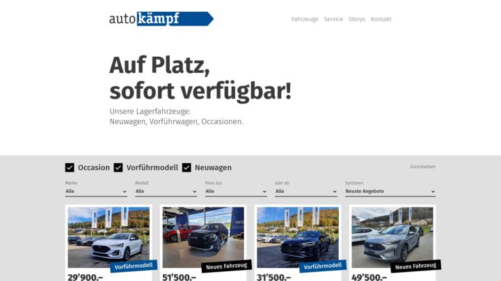
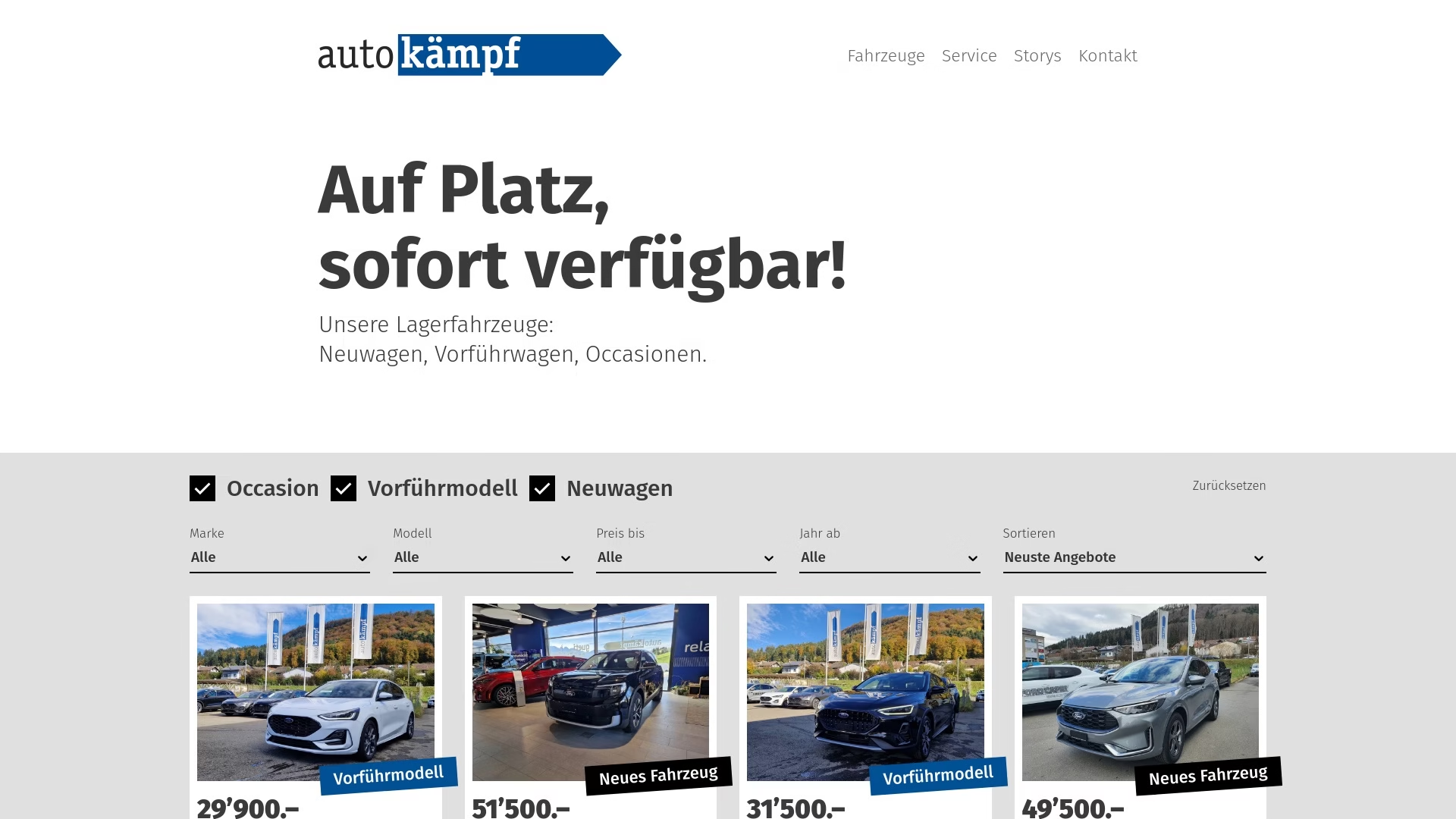
Displaying available vehicles from the AutoScout24 API
Since 2021
Integration of a customised vehicle selection on a WordPress website, based on data from an external interface.
-

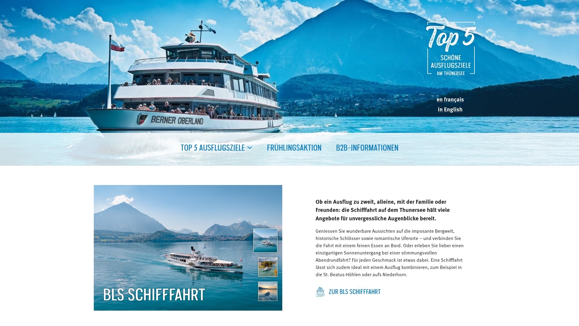
A cost-effective website to promote the beauty of the region
Summer 2025
When a local tourism organisation needed a small website, I offered them a cost-effective solution with a customised design and flexible page layout.
-
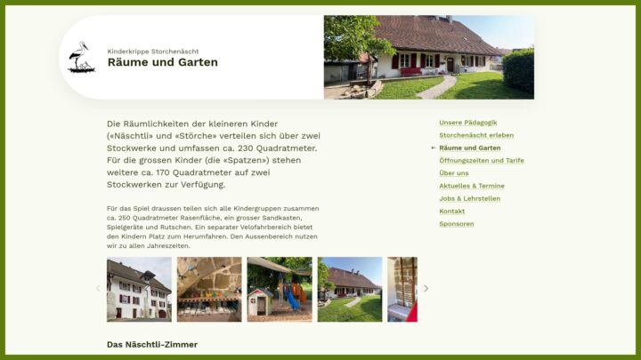
Modernising an existing website with WordPress
Summer 2025
A quick redesign and modernisation of an existing website with optimal use of the WordPress Block Editor.